CHART SCALES
Published by Ian Fortey in Tools and Calculators Last updated on March 15, 2022
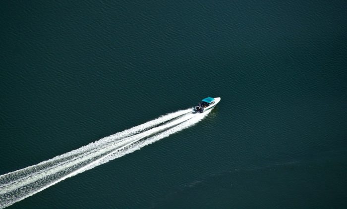
A nautical chart is far more in depth than a standard map. Nautical charts contain a lot of useful information. A typical map may just show you the distance from one place to another. Nautical maps and charts use NOAA data to show much more than distance. Whether they’re paper charts or electronic, they offer valuable information. Things like tide tables and water depths.
Let’s take a look at what nautical scale charts mean in terms of longitude and latitude. Also, how they can help with boat navigation. And how a navigator can read any chart they get from a place like West Marine. Also, how to understand scale charts to assist in finding your way around the world.
What is Nautical Chart Scale?

Scale charts are obviously the kinds of charts you’re going to use as a navigator. No one is going to make a life sized chart, right? That means you need to understand the chart system. Things like latitudinal scales and longitudinal scales.
Depending on the type of charts you’re using, there will be different scales. Harbor charts often use a scale of 1:10,000. Coastal charts are usually at a greater scale. You can find these scale charts at 1:50,000. Sometimes these scale charts go up to 1:150,000.
What Does Scale Mean?
Simply put, chart scales shrink things. Any chart, whether they’re paper charts or electronic, need to make information easy to read. Because the real world is large, we shrink it onto charts.
A scale that is 1:10,000 means that anyone one unit of measure on the chart is 10,000 times bigger in real life. Or, to put it another one, every section on the chart is 1/10,000 of the area it really represents.
Say you are reading a nautical chart and it tells you there is an island one inch away from you. If the scale is 1:50,000 you know that, in real terms, the island is 50,000 inches from your position. That’s about 0.68 nautical miles.
Remember, one mile equals about 0.869 nautical miles.
One nautical mile = about 1.15 miles
Scale charts shrink things down to show important features. Larger scale charts will always show more detail. If you’re navigating a narrow passage or new area, you want the largest scale chart you can find. Smaller scale charts tend to show much larger spaces. Open areas of the sea will have the largest scale charts of all. There are few details you need to know on the open water, after all.
What Do Paper Charts Show?
As we have said, the symbols on nautical charts show much more than just points of interest.
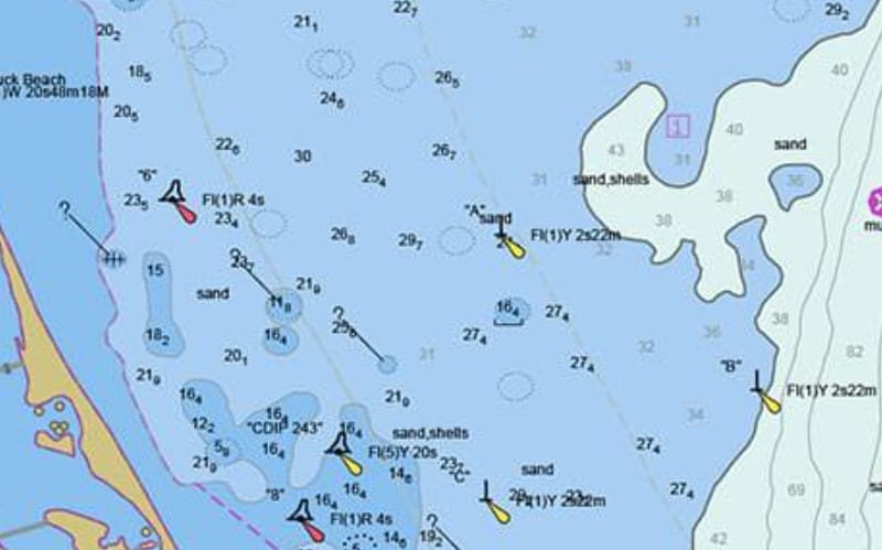
Water Depth: The National Oceanic and Atmospheric Association is known as NOAA. The NOAA provides information to include water depth on charts. Water depth is based on the mean lower low water level. This is the average height of the lowest tide recorded. The number is recorded at a tide station every day during a recording period. Water depths are also known as soundings. Either term can be used.
Depth Features: Using the info from the NOAA, a chart can also show things like reefs and sandbars. The chart will show these in different colors. They may not be visible on the water, however. It depends on the tide at the time you’re out on your boat.
Hazards: A chart can show dangers to boaters. Different hazards are visible or not depending on the tide. The chart will mark a hazard like a rock with an X symbol. This lets you know to steer clear. Even at high tide, a rock can damage your keel. It could also alter water flow which can affect your boat.
Buoy Information: Buoys are placed in water ways as navigation aids. The navigator can use these to determine the safest passage. Nautical charts depict buoys with several shapes and colors.
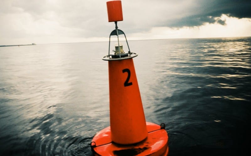
Red cones: This shape indicates what is called a nun buoy. It will be labelled as RN on the chart for red nun. They feature even numbers.
Green cylinders: This shape is called a can buoy. This will be labelled on a chart as GC for green can. They feature odd numbers.
As you return to harbor, red nuns will be on your right. The green cans will be on your left.
Land Features: Charts will show you the topography of the shoreline. They will also show any islands, reefs, and sandbars. On some older charts these features have actually changed. This is the result of things like urbanization and construction. Climate change and natural disasters can also affect these. Most electronic charts are more up to date for obvious reasons.
Things such as piers, docks, bridges and more will all be included on a chart.
Light Markers: Charts can indicate information about light markers for you. The information listed will read something like Fl R 5s 25ft 3M “4.”
- The first three letters “Fl R” indicate that this marker flashes red.
- The 5s means it flashes at an interval of every 5 seconds.
- The 25ft means that the light is affixed 25 feet in the air.
- The 3M means that the light will be visible for 3 miles.
- The 4 is the number on the light marker, Numbers on buoys and markers decrease as you head out to sea.
Date: The date on a chart may not seem relevant at first, but it is. Chart data changes constantly. Paper charts can become outdated very quickly. Features change, buoys are removed or replaced. Make sure you are relying on up to date charts. If you try to use a chart that is too old to navigate, you may run into trouble.
Understanding Chart Coordinates
The latitude and longitude scales on a chart allow for coordinate navigation. Latitude lines divide up the earth on a horizontal scale, from top to bottom going north to south. They start at the equator which is 0 degrees latitude. North they go up to the north pole at 90 degrees north latitude or 90°N. South they reach the south pole at 90 degrees south latitude or 90°S.
Longitude lines are the vertical lines. These extend from pole to pole. At 0° the line runs through Greenwich in England. At that point the lines go east or west. You can go east or west around the world to 180°. That line passes through the Pacific Ocean.
- Each line of longitude or latitude is called a degree.
- Each degree is broken into 60 minutes.
- Each minute is broken into 60 seconds.
You can use the breakdown of minutes and seconds of latitude and longitude. This will let you pinpoint an exact location. When you measure down to seconds of latitude and longitude, you can be accurate to about 80 to 100 feet.
There are two different ways to read coordinates on a chart. Traditional nautical charts use minutes and seconds. This is what is called a sexagesimal degree. Sexagesimal refers to a system that is base 60. That is why there are 60 minutes and 60 seconds. In contrast, the metric system is base 10. This system is sometimes abbreviated as DMS. That stands for degrees-minutes-seconds.
There is a second system that is used more often on land. Modern electronic mapping may also use this other system. Abbreviated as DD, it refers to decimal degrees.
In DMS the US capitol is located at 38° 53′ 23″ N, 77° 00′ 32″ W
In DD the US capital is located at 38.8897, -77.0089.
The DD system offers a greater degree of accuracy. If you extend the decimals to 6 places it is accurate enough to identify something as small as a human on a map. If you extend it to 8 decimal places it can pinpoint a spot on a map that is so small it’s barely visible to the naked eye. Obviously no one would ever need chart scales this refined in day to day life.
There is a formula that can convert the DMS coordinates into DD coordinates.
Nautical Chart Terms to Know
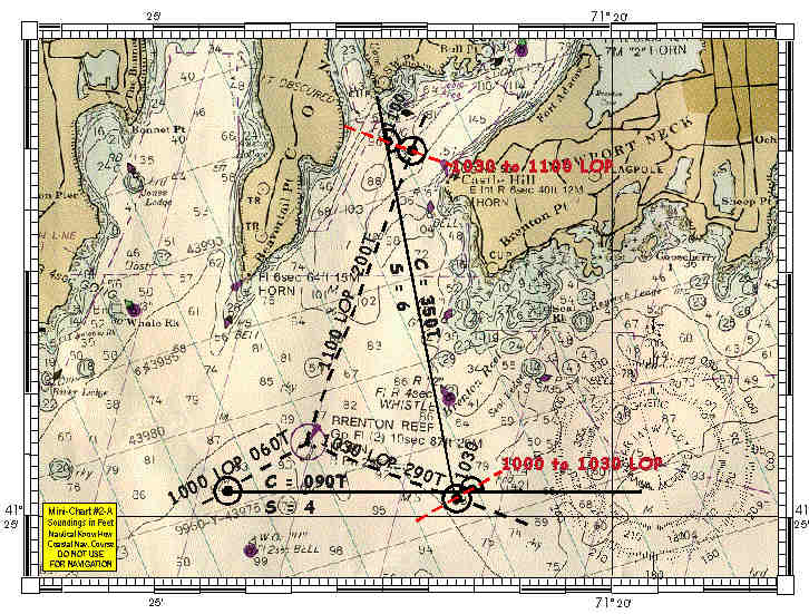
Chart Datum: The word datum is the singular of data. On a nautical chart, however, chart datum has a specific meaning. It refers to the water level that is used to measure depths on the chart.
Dividers: Dividers are used to measure distances on a chart. You can use dividers to transfer the distance between objects on the chart to the latitude scale. Likewise dividers can take the scale over to objects. Dividers look like a math compass, two metal legs attached to a center hinge. Each point can be placed on a chart to get an accurate measure of the distance between two places. Then the dividers are lifted and lined up with the scale to determine an accurate distance.
Much of the work of dividers is done electronically these days. However, if you need to use paper charts, dividers are essentially. It’s also fun to learn how to read these distances on paper charts. It’s an interesting piece of nautical history.
Compass Rose: Every chart will have a compass rose. The compass rose will show the direction of true north and magnetic north. The other circle is the one that directs to true north. The inner points to magnetic north. You can use a handheld compass to plot your course using the information on a compass rose.
If you are new to navigation this may be confusing. Why are there two norths? True north is a fixed point on a map. This is what we call the North Pole and it cannot move. But the Earth’s magnetic field does change somewhat. It is not constant all over the world. So magnetic north and true north are not always the same thing. A compass rose shows both and the variance between them.
Longitude Scale: Longitude scales are the horizontal lines on a map. These do not measure distance. That is because the distance between these lines can change. Longitude lines get further apart as you go north. They are closer together near the equator.
Latitude Scale: Latitude scales on a Mercator chart are used to measure distance. This scale is up the side of a nautical chart. It is the vertical scale. One minute of latitude equals one nautical mile.
Land Features: These are any notable and relevant features of the land. Islands, coastline, and other topography relevant to mariners.
Mercator Projection: The world is not flat but maps are. A mercator projection puts a chart on a cylinder. When you do this, the latitude lines all have the same length as the equator. It preserves distances and shapes while keeping North and South where they belong.
C Map: C Map Genesis is a popular marine mapping program. It can be downloaded as a phone app and features detail maps for almost everywhere.
Harbor Charts: A harbor chart is a specific kind of nautical chart. It features more detail and a larger scale. It’s used to show smaller waterways and harbors.
Rhumb Line: On a mercator chart, a rhumb line is a straight line. It is used to represent a steady course or bearing. It’s the shortest distance between two points, typically.
Chart Compatibility
Remember that charts are made by several agencies, including NOAA. Different countries also have their own standards for making charts. A US chart and a Canadian chart will look nearly identical. The symbols will be the same. However, Canadian charts will use metric measurements. Always remember to check the small details.
Computing Scales
This tool can help you determine scale quickly.
Given the Scale, Compute Nautical Miles, Statute Miles and Feet
| Scale: | 1: |
| Results: | |
| Nautical Miles Per Inch: | |
| Statute Miles Per Inch: | |
| Inches Per Nautical Mile: | |
| Inches Per Statute Mile: | |
| Feet Per Inch: |
Categories: Tools and Calculators